
Parametri
- 196pagine
- 7 ore di lettura
Maggiori informazioni sul libro
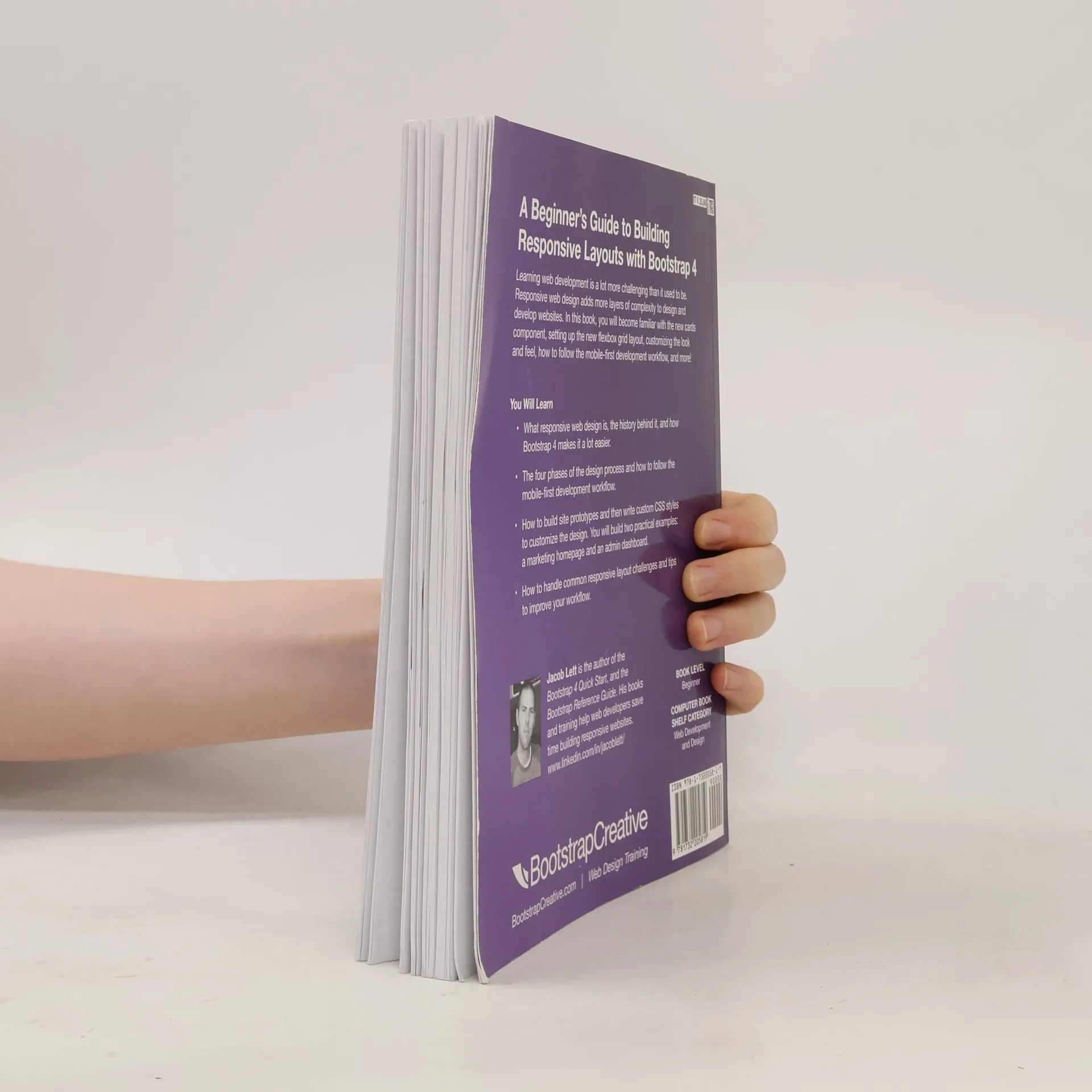
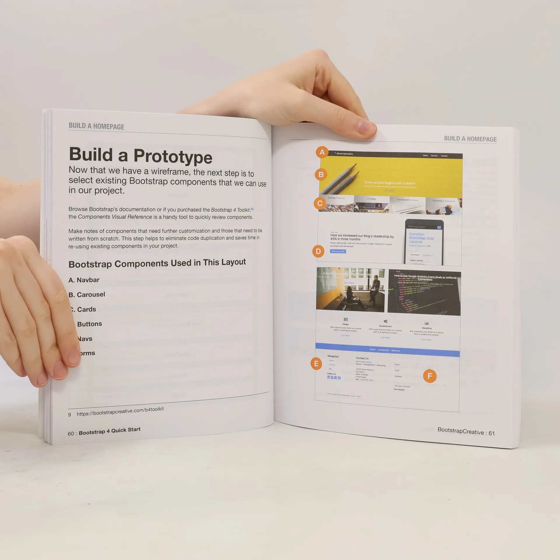
Code examples updated to v4.2.1 Jan. 2019 Learning web design and development (html & css) is a lot more challenging than it used to be. Responsive web design adds more layers of complexity to design and develop websites. In this book you will become familiar with the new cards component, setting up the new flexbox grid layout, customizing the look and feel, how to follow the mobile-first development workflow , and more! Web designer and developer Jacob Lett has built 100+ websites and WordPress themes. Let him show you exactly how to build responsive layouts that look great in every browser and device. He shares what you can't learn from the official documentation... the process of actually building a full web design layout. This book is focused on the workflow and does not duplicate what you can already find in the official documentation . This book will show you how to reference the documentation and use it effectively in your projects. Who is this for? What will I learn? What will I build? How is this training unique? What do I need? You want to build a beautiful website or user interface that works on all major browsers. Let Jacob show you how step by step. If you like detailed step by step guides, plenty of examples, and printable cheat sheets, then you’ll love Jacob Lett’s approach at how he creates responsive layouts using Bootstrap 4.
Acquisto del libro
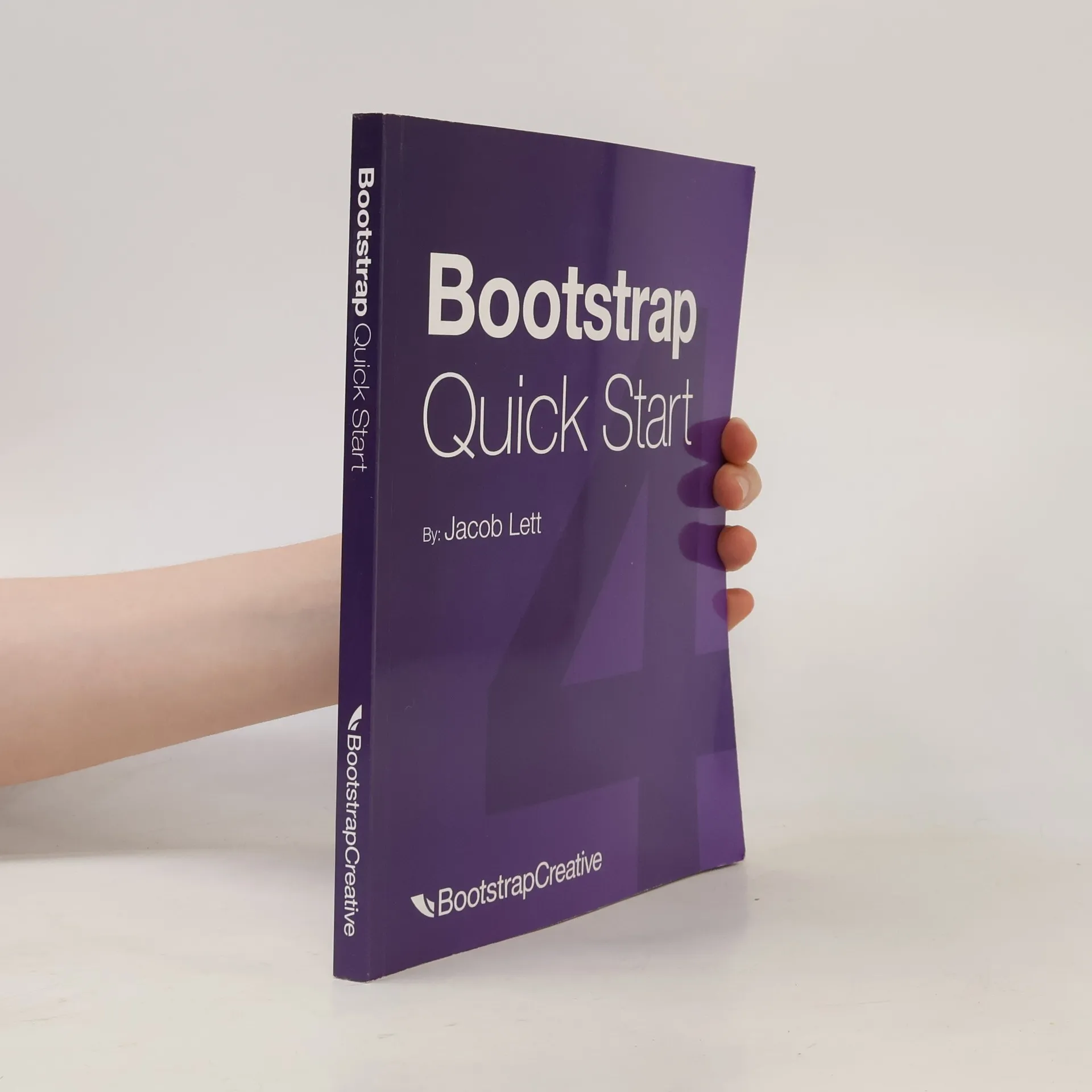
Bootstrap 4 Quick Start, Jacob Lett
- Lingua

- Pubblicato
- 2018
- product-detail.submit-box.info.binding
- (In brossura),
- Condizioni del libro
- In buone condizioni
- Prezzo
- 1,99 €
Metodi di pagamento
Ancora nessuna valutazione.
- Titolo
- Bootstrap 4 Quick Start
- Sottotitolo
- A Beginner’s Guide to Building Responsive Layouts with Bootstrap 4
- Lingua
- Inglese
- Autori
- Jacob Lett
- Editore
- Bootstrap Creative
- Pubblicato
- 2018
- Formato
- In brossura
- Pagine
- 196
- ISBN10
- 1732205817
- ISBN13
- 9781732205819
- Serie
- Tag
- Saggistica, Libri di testo, Tecnologia & Ingegneria, Auto-aiuto, Computer & Internet, Creazione di Siti Web
- Descrizione
- Code examples updated to v4.2.1 Jan. 2019 Learning web design and development (html & css) is a lot more challenging than it used to be. Responsive web design adds more layers of complexity to design and develop websites. In this book you will become familiar with the new cards component, setting up the new flexbox grid layout, customizing the look and feel, how to follow the mobile-first development workflow , and more! Web designer and developer Jacob Lett has built 100+ websites and WordPress themes. Let him show you exactly how to build responsive layouts that look great in every browser and device. He shares what you can't learn from the official documentation... the process of actually building a full web design layout. This book is focused on the workflow and does not duplicate what you can already find in the official documentation . This book will show you how to reference the documentation and use it effectively in your projects. Who is this for? What will I learn? What will I build? How is this training unique? What do I need? You want to build a beautiful website or user interface that works on all major browsers. Let Jacob show you how step by step. If you like detailed step by step guides, plenty of examples, and printable cheat sheets, then you’ll love Jacob Lett’s approach at how he creates responsive layouts using Bootstrap 4.