
• Features up-to-date color combination guidelines• Includes printing formulas for reproduction of 4-color process and the PANTONE® equivalentsThere is no one in the business world that doubts the impact of color. Those involved in marketing, design, advertising, and retail need to be as informed as possible about the usage of color as a means of instant communication in order to make appropriate color decisions.This guide explains the emotional response to color and covers the latest guidelines for effective color combinations including the integration of color trends. With up-to-date visuals and printing formulas to eliminate guess-work, this guide empowers and equips its users to make smart informed decisions.
Leatrice Eiseman Libri
Leatrice Eiseman è una specialista del colore americana di spicco, che consiglia le aziende sulla scelta dei colori per packaging, loghi e interior design. La sua competenza deriva da un background in psicologia e da uno studio approfondito della moda e del design. Eiseman si concentra sulla psicologia del colore e sul suo impatto sulla percezione del consumatore e sulle strategie di marketing. Il suo lavoro aiuta a definire l'identità visiva di marchi e prodotti.
Pantone on Fashion A Century of Color in Design
- 127pagine
- 5 ore di lettura
Follow global color authority Pantone on this vivid journey through the rich history of color in fashion. Favorite hues and their appearances across the decades are profiled in informative text and copiously illustrated by runway photos and archival images. Track Bright Marigold from its heyday in the 1940s as Hermès' identifying hue to its showstopping appearance in Carolina Herrera's Spring/Summer 2013 collection, and trace Cyber Yellow from 1960s mod style to Anna Sui's 1990s punk-inspired looks. Complete with a survey of the industry-defining PANTONE Color of the Year, »PANTONE on Fashion« is the ultimate guide to the timeless shades the fashion world loves to love.
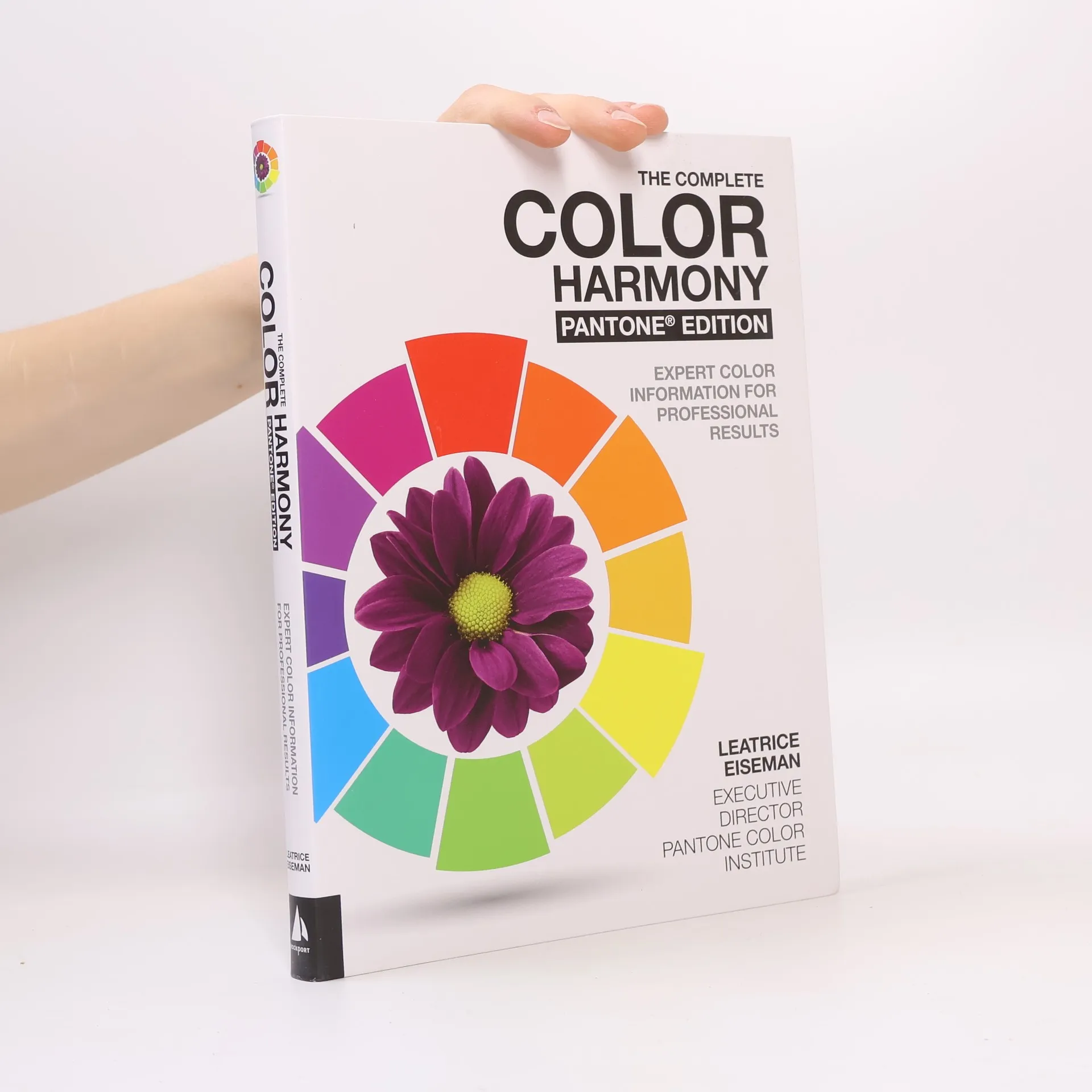
The Complete Color Harmony, Pantone Edition
- 216pagine
- 8 ore di lettura
The only color guide a designer will ever need; The Complete Color Harmony, Pantone Edition has been completely updated with Pantone colors and new text.
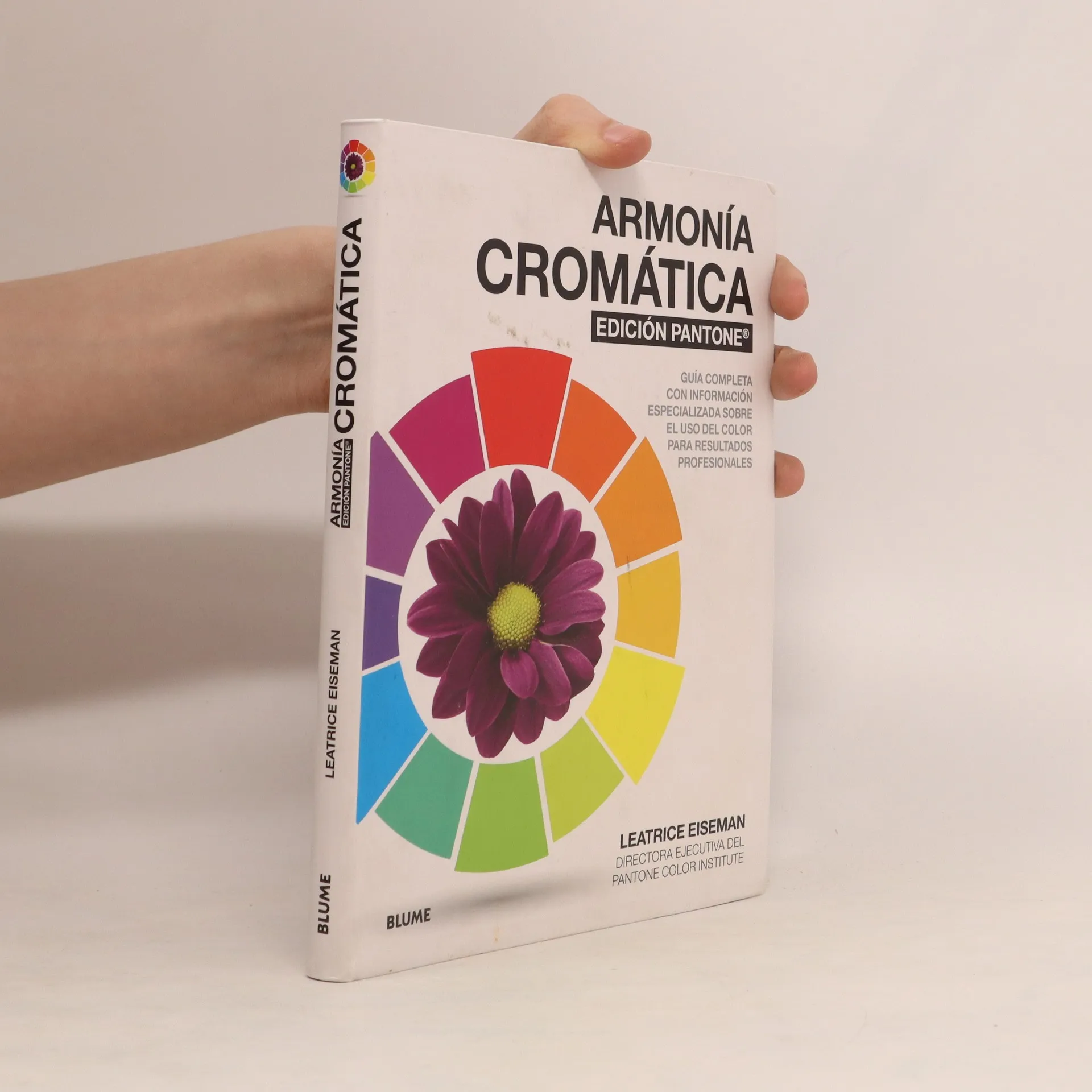
Armonía cromática
- 216pagine
- 8 ore di lettura
Pantone
- 208pagine
- 8 ore di lettura
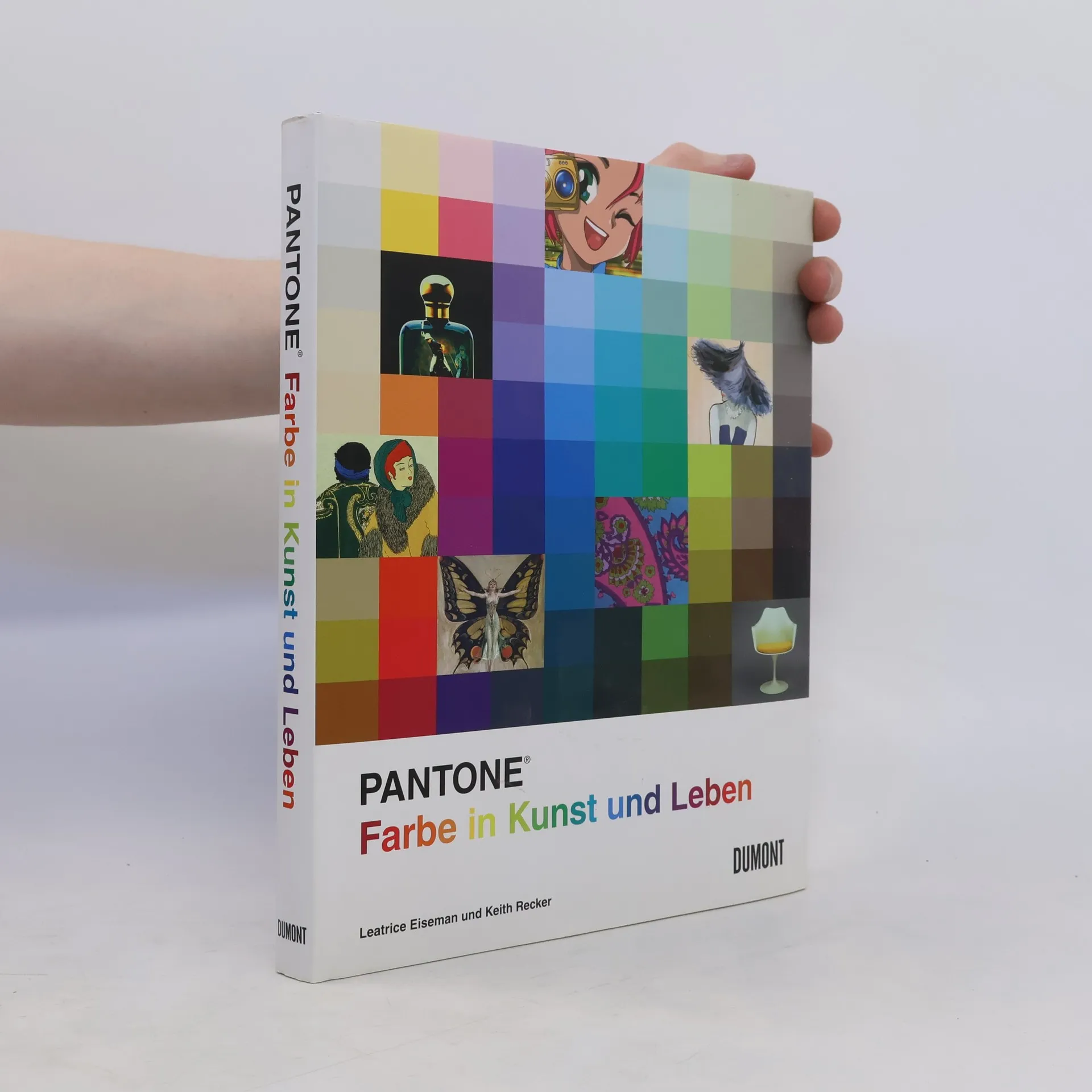
Spricht man über Farben, so gab und gibt es nur einen Begriff: Pantone®. Für Designer, Künstler, Kreative, Art Direktoren und Hersteller auf der ganzen Welt ist Pantone der maßgebende und universell anerkannte Standard für exakte Farbkommunikation. Wie kann man Farbe messen? Das ›Pantone Farbenbuch‹ erzählt Geschichte und Evolution der Farbe im 20. Jahrhundert. Mit vielen Farbpaletten, Fotografien und Hintergrundtexten. Die Verbindung zwischen historischen wie kulturellen Ereignissen und den Farbnuancen, die ihre Ästhetik prägten, war noch nie offensichtlicher: vom gedämpften Braun und Cremeweiß des sittsamen frühen 20. Jahrhunderts bis zu den unverkennbaren Avocado- und Gold-Tönen der wilden 1970er Jahre. Das Farbsystem, ursprünglich für grafische Anwendungen entwickelt, wurde schnell wegweisend in der Farbkommunikation und -technologie, für die Grafik- und Designbranche, das Verlags- und Druckwesen sowie die Textil- und Kunststoffindustrie. Pantone-Standard macht es möglich, dass Farben in jedem Medium mess- und übertragbar werden. Arts-and-Crafts-Bewegung; Fauvismus; Erster Weltkrieg; Art Déco; Wiener Werkstätten; ›American Dream‹; Kubismus; Pastellfarben; Film Noir; Cocktail-Lifestyle; Bauhaus; Warhols Welt; Punk; Neon - Pantone® ist Kult - Die Farben aus zehn Jahrzehnten in Kunst und Kultur - Farb- und Gefühlswelten zum Nachschlagen