Più di un milione di libri, a un clic di distanza!
Bookbot

Stephen Few

    The Data Loom
    Big Data, Big Dupe
    Information Dashboard Design
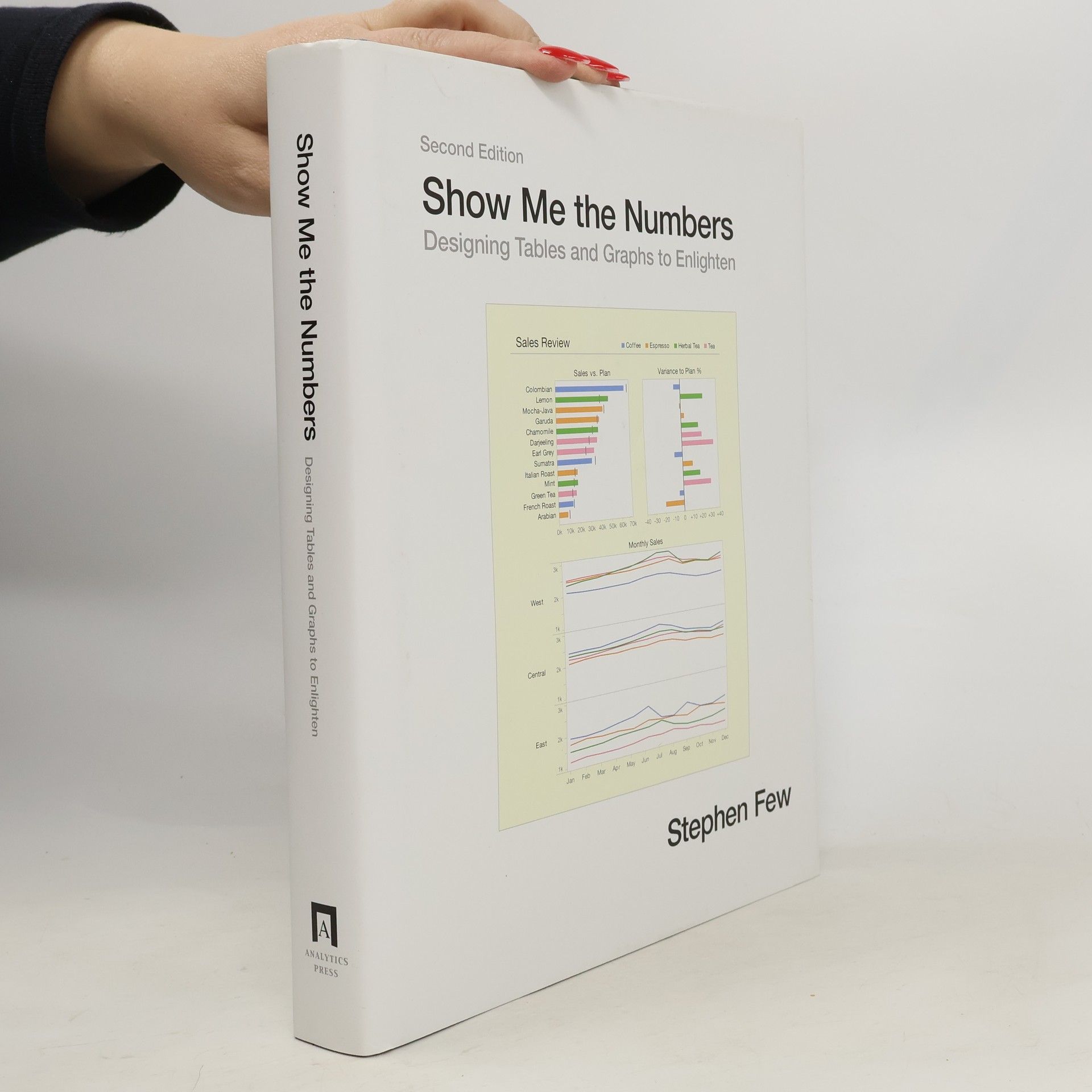
    Show me the numbers : designing tables and graphs to enlighten
    Now You See It: An Introduction to Visual Data Sensemaking
    • Before you can present information to others, you must understand its story. Now You See It teaches the concepts, principles, and practices of visual data sensemaking. The skills taught in this book rely primarily on something that most of us possess—vision—interactively using graphs to find and examine the meaningful patterns and relationships that reside in quantitative data. Although some questions about quantitative data can only be answered using sophisticated statistical techniques, most can be answered using relatively simple visual data sensemaking skills. Until Now You See It was published, no book taught these basic skills comprehensively and in a way that was accessible to a broad audience. Even though these skills can be developed by anyone with eyes to see, they are not intuitive—they must be learned. Without these skills, even the best data visualization tools are of little use, and data will remain nothing but noise.

      Now You See It: An Introduction to Visual Data Sensemaking
    • Information, no matter how important, cannot speak for itself. To tell its story, it relies on us to give it a clear voice. No information is more critical than quantitative data ... numbers that reveal what's happening, how our organizations are performing, and opportunities to do better. Numbers are usually presented in tables and graphs, but few are properly designed, resulting not only in poor communication, but at times in miscommunication. This is a travesty, because the skills needed to present quantitative information effectively are simple to learn. Good communication doesn't just happen; it is the result of good design.

      Show me the numbers : designing tables and graphs to enlighten
    • Dashboards have become popular in recent years as uniquely powerful tools for communicating important information at a glance. Although dashboards are potentially powerful, this potential is rarely realized. The greatest display technology in the world won't solve this if you fail to use effective visual design. And if a dashboard fails to tell you precisely what you need to know in an instant, you'll never use it, even if it's filled with cute gauges, meters, and traffic lights. Don't let your investment in dashboard technology go to waste. This book will teach you the visual design skills you need to create dashboards that communicate clearly, rapidly, and compellingly. Information Dashboard Design will explain how to: Stephen Few has over 20 years of experience as an IT innovator, consultant, and educator. As Principal of the consultancy Perceptual Edge, Stephen focuses on data visualization for analyzing and communicating quantitative business information. He provides consulting and training services, speaks frequently at conferences, and teaches in the MBA program at the University of California in Berkeley. He is also the author of Show Me the Numbers: Designing Tables and Graphs to Enlighten.

      Information Dashboard Design
    • Big Data, Big Dupe

      • 96pagine
      • 4 ore di lettura

      Argues against the value of big data, suggesting that it is a marketing campaign that distracts from the real and important work of deriving value from data.

      Big Data, Big Dupe
    • The Data Loom

      • 142pagine
      • 5 ore di lettura

      Contrary to popular myth, we do not yet live in the "Information Age." At best, we live the "Data Age," obsessed with the production, collection, storage, dissemination, and monetization of digital data. But data, in and of itself, isn't valuable. Data only becomes valuable when we make sense of it. We rely on "information professionals" to help us understand data, but most fail in their efforts. Why? Not because they lack intelligence or tools, but mostly because they lack the necessary skills. Most information professionals have been trained primarily in the use of data analysis tools (Tableau, PowerBI, Qlik, SAS, Excel, R, etc.), but even the best tools are only useful in the hands of skilled individuals. Anyone can pick up a hammer and pound a nail, but only skilled carpenters can use a hammer to build a reliable structure. Making sense of data is skilled work, and developing those skills requires study and practice. Weaving data into understanding involves several distinct but complementary thinking skills. Foremost among them are critical thinking and scientific thinking. Until information professionals develop these capabilities, we will remain in the dark ages of data. This book is for information professionals, especially those who have been thrust into this important work without having a chance to develop these foundational skills. If you're an information professional and have never been trained to think critically and scientifically with data, this book will get you started. Once on this path, you'll be able to help usher in an Information Age worthy of the name

      The Data Loom