Più di un milione di libri, a un clic di distanza!
Josh ClarkLibri
Josh Clark è un visionario nel design digitale, focalizzato su dispositivi connessi ed esperienze utente. Il suo lavoro modella il modo in cui interagiamo con la tecnologia, dalle interfacce mobili ai siti web responsive. Clark fonde la sua profonda conoscenza del design con un approccio unico all'esperienza utente, come dimostra il suo motto: 'nessun dolore, nessun dolore', applicato sia al fitness che al software. Prima della sua carriera nel design, è stato pioniere di programmi popolari e ha contribuito all'evoluzione della comunicazione digitale.
Josh Clark and Chuck Bryant, creators of the popular podcast 
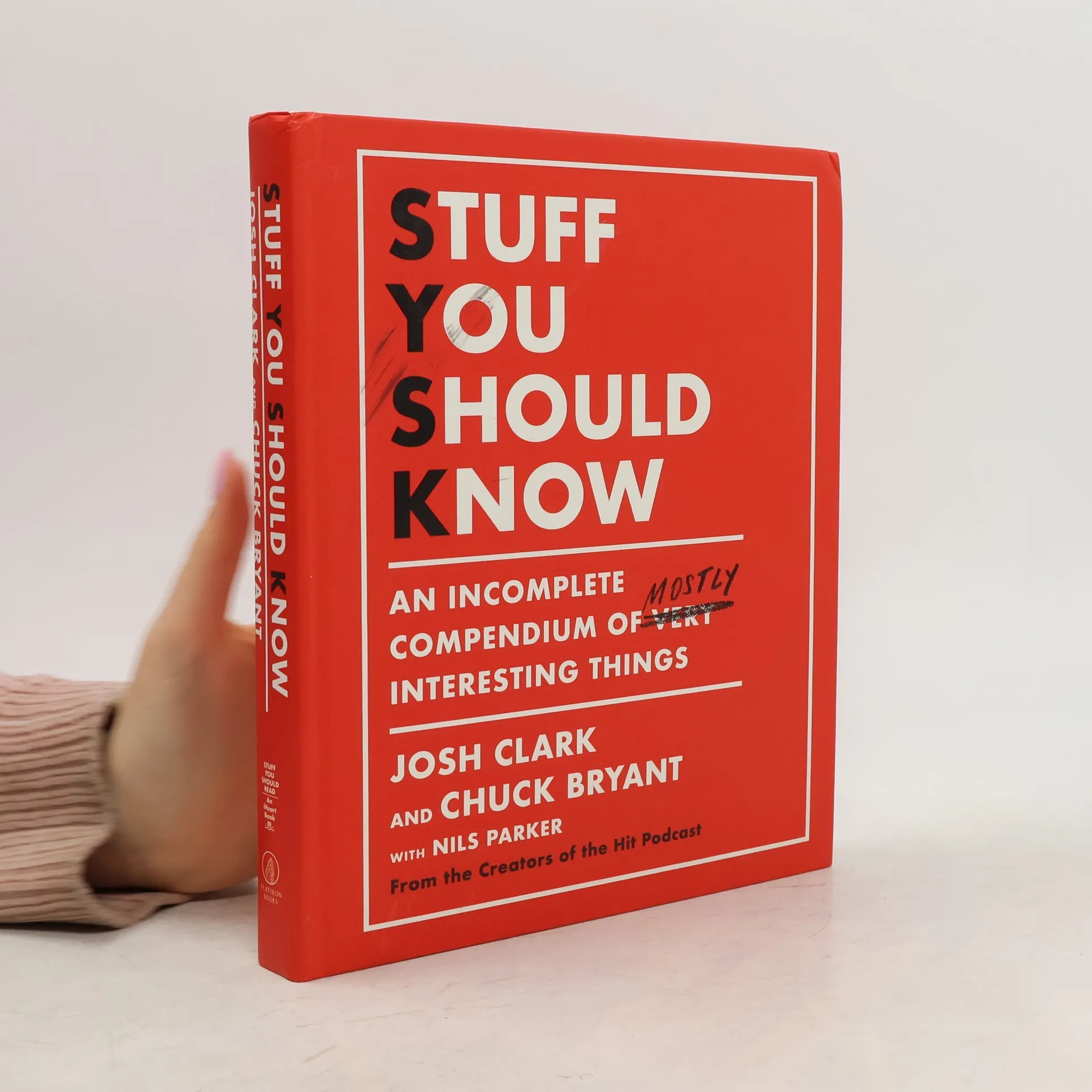
Stuff You Should Know, explore a variety of intriguing topics in their first book. With humor and curiosity, they delve into subjects like Murphy beds and the psychology of being lost, enhanced by visuals like charts and illustrations. Join them for an engaging journey of discovery!
So you've got an idea for an iPhone app -- along with everyone else on the planet. Set your app apart with elegant design, efficient usability, and a healthy dose of personality. This accessible, well-written guide shows you how to design exceptional user experiences for the iPhone and iPod Touch through practical principles and a rich collection of visual examples. Whether you're a designer, programmer, manager, or marketer, Tapworthy teaches you to "think iPhone" and helps you ask the right questions -- and get the right answers -- throughout the design process. You'll explore how considerations of design, psychology, culture, ergonomics, and usability combine to create a tapworthy app. Along the way, you'll get behind-the-scenes insights from the designers of apps like Facebook, USA Today , Twitterrific, and many others. Ten Tips for Crafting Your App’s Visual IdentityVoices (left) has a Vaudeville personality appropriate to a funny-voices novelty app. iShots Irish Edition (right) creates a gritty dive-bar ambience for its collection of drink recipes.Wine Steward uses standard lists (known as table views in iOS) but creates a vintage ambience by draping a backdrop image across the screen. The app adds a parchment graphic to the background of each table cell, making each entry appear to be written on an aged wine label. The burgundy-tinted navigation bar maintains the app’s wine flavor.