Maggiori informazioni sul libro
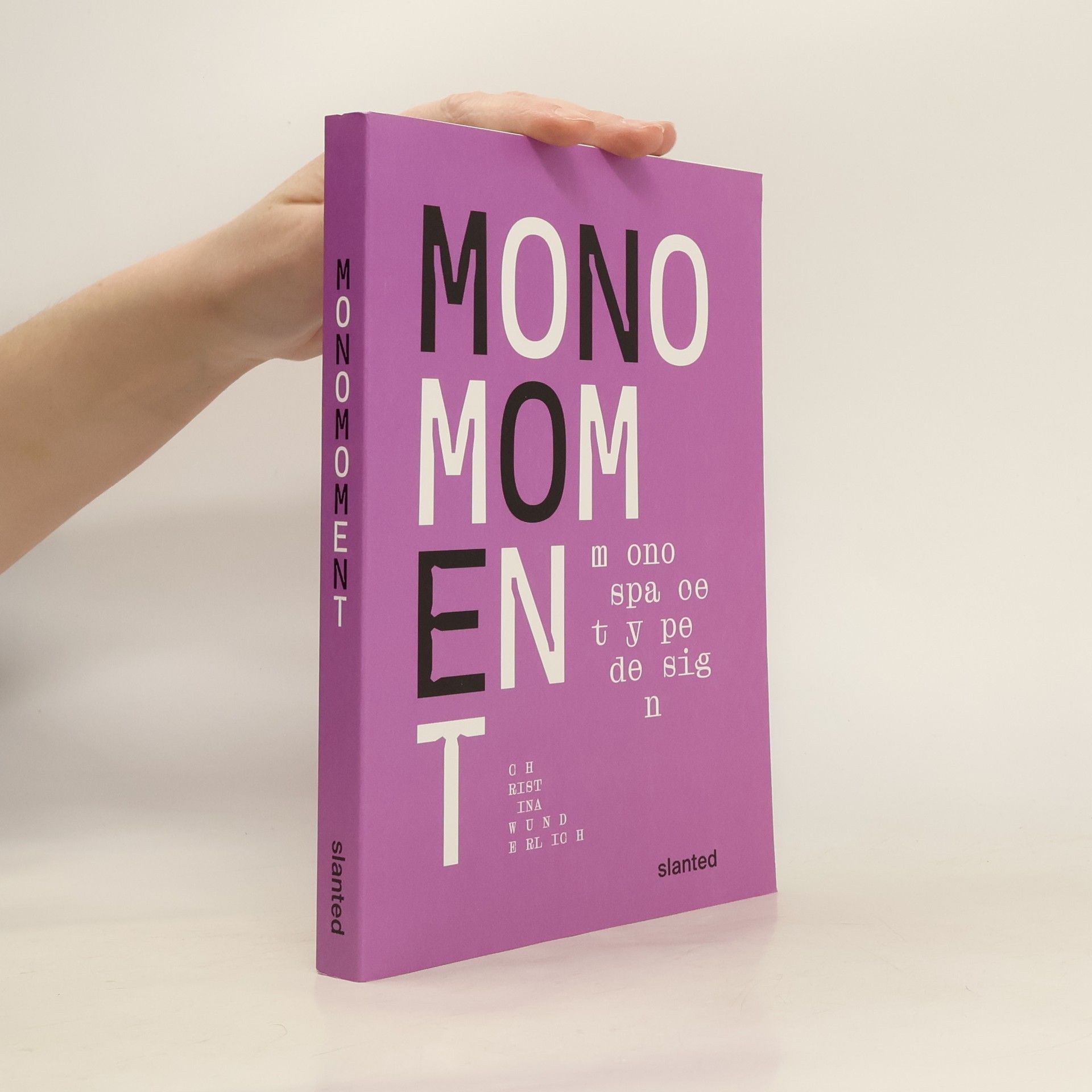
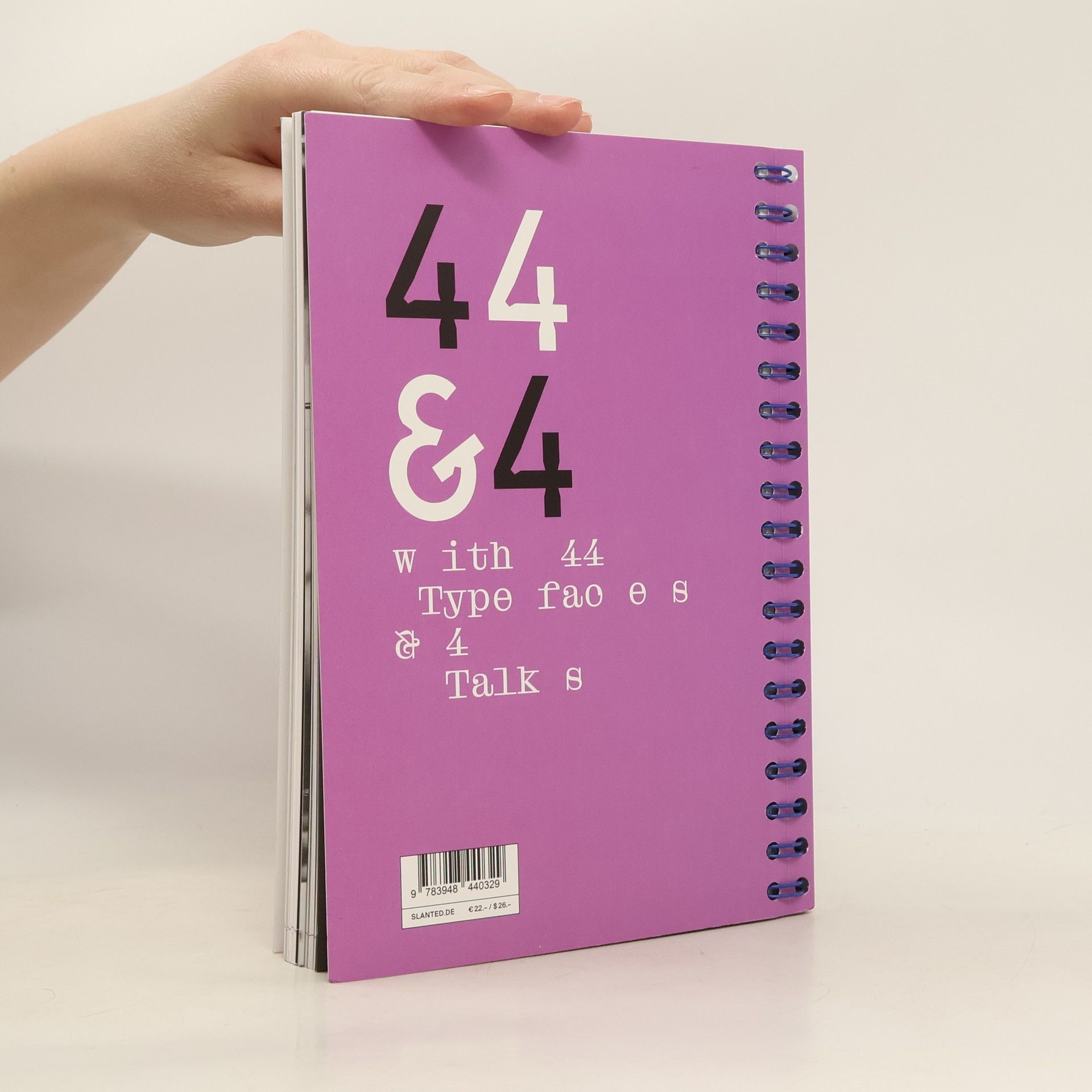
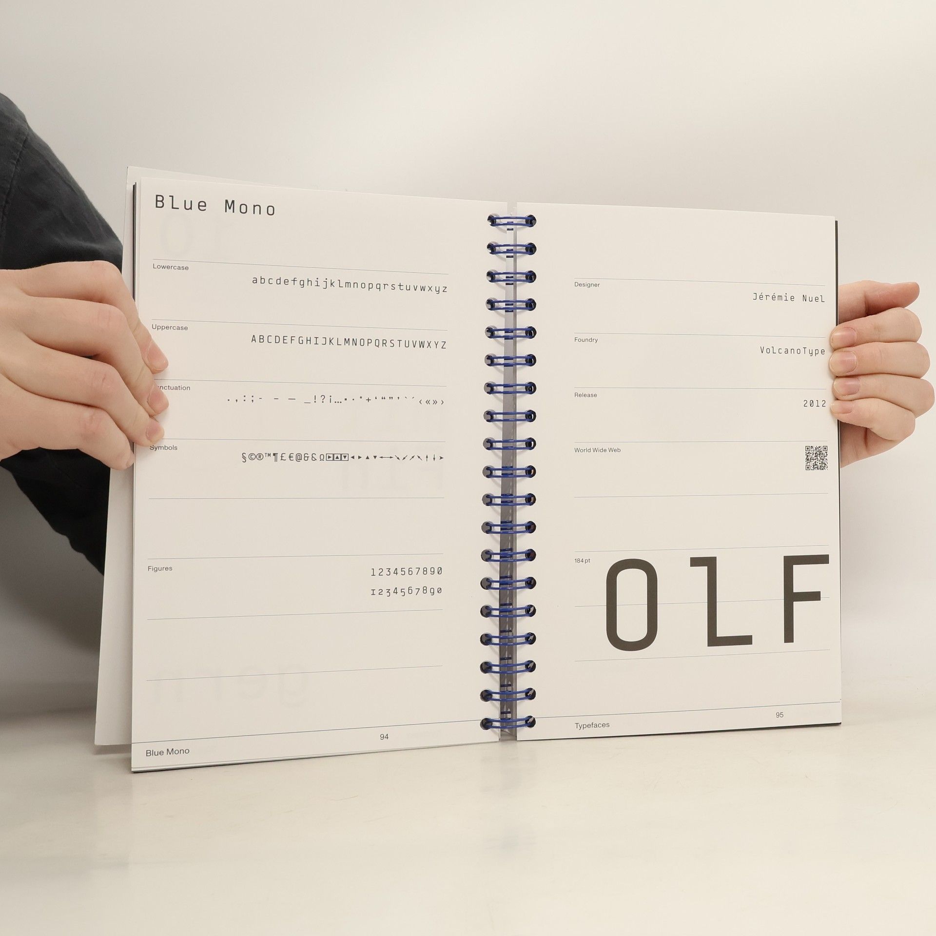
Monospaced fonts are captivating! This publication targets type designers, typographers, and those new to type design, serving as both a reference and a source of inspiration. Friedrich Nietzsche was among the first to appreciate the aesthetic of monospaced typefaces, recognizing their importance since he began using a typewriter. Today, monospaced typefaces are prevalent in various aspects of daily life, from design and art to coding and official documents. A closer examination reveals that non-proportional typefaces are more common than one might think. Monospaced typefaces feature fixed, equal widths for all characters, meaning each letter and number occupies the same horizontal and vertical space. In contrast, proportional typefaces have variable widths, creating a more balanced appearance. This raises the question: what is the allure of typefaces where each character occupies an identical space? With the surge in typeface production over recent decades, most well-developed font families now include a mono or semi-mono cut. Searching for “monospace” online yields numerous results, from inquiries about beautiful monospaced fonts to lists of the best options for coding. In an era where designing and publishing typefaces is easier than ever, this book offers valuable guidance on the world of monospace!
Acquisto del libro
Mono Moment - Monospace Type Design, Slanted Publishers UG
- Lingua
- Pubblicato
- 2022
- product-detail.submit-box.info.binding
- (In brossura)
Metodi di pagamento
Qui potrebbe esserci la tua recensione.


